The Monas Heiroglyphica was as savvy as any visual identity today. So what influenced Brand Dee?
He spied for Elizabeth I, rubbed shoulders with great explorers, inspired Shakespeare’s Prospero and nearly owned Canada. But John Dee, the Tudor polymath, cryptologist, expert in navigation and court magus, is less well-known for his foray into brand identity...
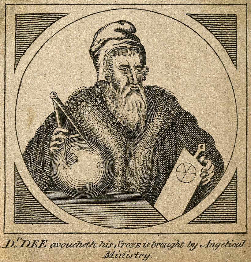 John Dee: Line engraving by W. Greatbach, 1842
Wellcome Collection
Born in 1527, Dee was an obsessive student who ‘did inviolably keep this order; only to sleep four hours every night, to allow to meate and drink two hours every day and of the other eighteen hours all… was spent in my studies and learning.’ His academic prowess helped him rise to become Elizabeth I’s counsel in political, state and maritime affairs – as well as her spiritual tutor in his personal blend of arcana.
Dee’s web of interests had many strands and he might have arrived at graphic design through cartography which he studied under Gerhardus Mercator. Mapmaking dovetailed with his commitment to global exploration and he supported the enterprises of seafarers like Drake, Raleigh and Frobisher – and would have been granted the rights to Canada from one voyage, had it been successful.
Business as Unusual
Dee also navigated more esoteric waters, being a confirmed votary of occult and Cabalistic practices. On one level this was perfectly natural, since any renaissance-educated man would have had at least a grounding in astrology and cosmology. Dee stepped back and forth freely between the mundane and the arcane, and, due to his insatiable appetite for learning, his exploration into the realm of the supernatural was equally enthusiastic.
However, even with the endorsement of the Queen, such studies were not without risk. Dee trod a thin line between science and witchcraft (he was once tried by the Star Chamber after casting a horoscope for Elizabeth and Mary) and was viewed with suspicion by his peers at court. But his occult endeavours yielded a fascinating output: hundreds of supposed conversations with angels, revelations from crystal-gazing, his own ‘Enochian language’. And, from the combination of these studies, Dee wove his logo design.
One glyph to rule them all
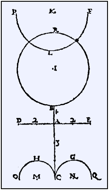 Dee’s Monad symbol
During a creatively and mystically fertile thirteen days in Antwerp in 1564, Dee developed a personal marque named the Monas Hieroglyphica. The name means ‘One Glyph’, (a glyph being, essentially, a letterform). This comprised both a symbol (the Monad) and an accompanying short booklet, giving an exhaustive explanation of the meaning of that symbol, written in twenty-four parts, or theorems.
Like the visual identity manuals of today, Dee’s marque came with strict style guidelines for use. ‘The proportions,’ he instructed, ‘must be observed by those who wish to engrave them upon their seals or their rings, or to utilise them in some other manner.’ This technical data supporting the design is meticulously recorded.
The Hieroglyphica went further than a technical manual, combining the artistic and the mystic. Dee believed his marque was imbued with the divine qualities of the universe and in his document he shows how the symbol breaks down into elements, zodiacal insignia, typography with inherent symbolism, a quaternity (a theme later featuring in Jung’s work), Judaeo-Christian and cabbalistic religious references and an alchemical aspect. It is a glorious amalgamation, a bubbling cauldron of eclectic ideas cast in from many sources familiar to the designer.
The manual was intended as a set of notes for Dee to use whilst explaining and presenting the symbol – a kind of Elizabethan Powerpoint. We know that he instructed Elizabeth herself in its supposed secrets. But Dee’s document also anticipates other users ‘engraving it on their seals or rings’. This is the point of visual identity – a means of sharing the owner’s story. The Monad design was certainly well-known by his contemporaries, one advocate being the chemist and alchemist Andreas Libavius, who used its shape as the ground plan for his proposed laboratories.
The TradeMark of the Beast?
Human beings – particularly those harbouring visions of global expansion as Dee did – invariably desire to ‘make their own mark’ and create items which will outlast them. Though the Monas Hieroglyphica had a grand narrative behind it, it is far easier to surmise that Dee was simply defining himself through his symbol, with a view to his own posterity. Like the heraldry of the Crusades, the cross or the swastika it was a kind of visual positioning or tribal statement – ‘wear my mark and you wear my ideals’. Today, it would probably be available on t-shirts in Dee’s web shop.
Carole Jahme writes: ‘Dee was collaborative in nature and a spiritual man; he appears to have been drawn to debate and the stimulation of the shared experience.’ Whether intentional or otherwise, by encapsulating himself and his creed in a symbol to be shared he created an explainer, an icon of remembrance.
So for all its supposed occult significance, the most magical effect of Dee’s symbol – probably exactly as the magician intended – has been to attune others to the ‘Key of Dee’. The Monad simply captures the spirit of an innovator whose influence still resonates down the centuries.
References
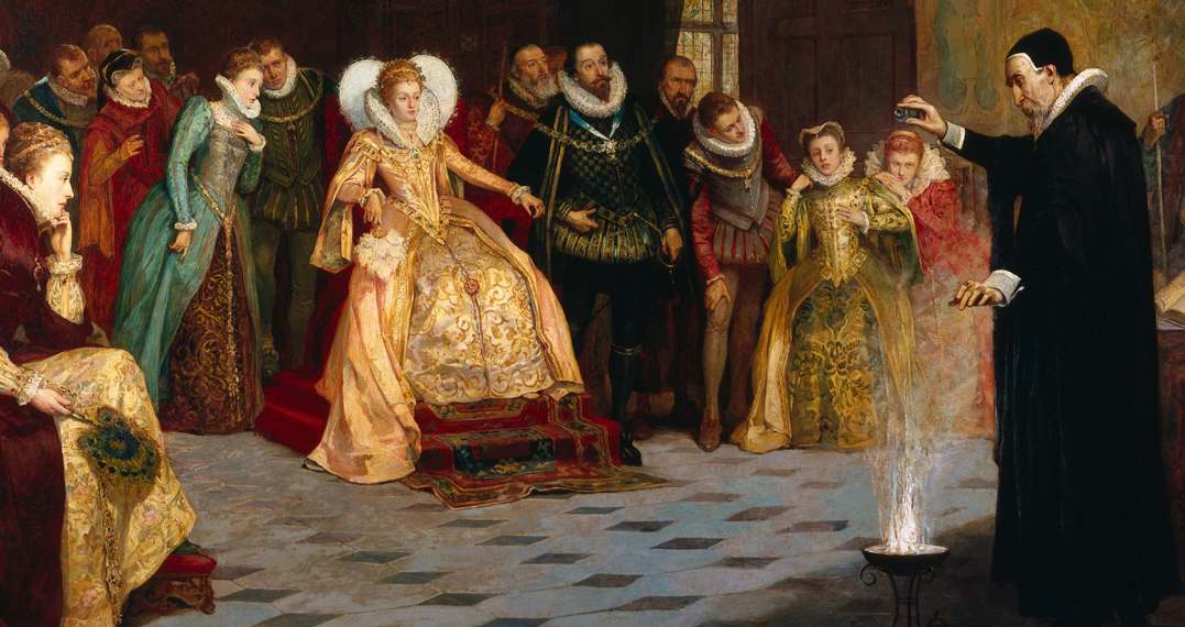
Top: John Dee performing an experiment before Queen Elizabeth I at his home, Mortlake House: oil painting by Henry Gillard Glindoni | Wellcome Collection: CC Licence


